“Everything is designed. Everything that you read is designed. Anything that is a sign on the street is designed.” — Paula Scher
Design is not always what we see. It is also what guides us implicitly, what makes decisions for us, what makes us feel that everything works… or what, without really knowing why, makes something uncomfortable.
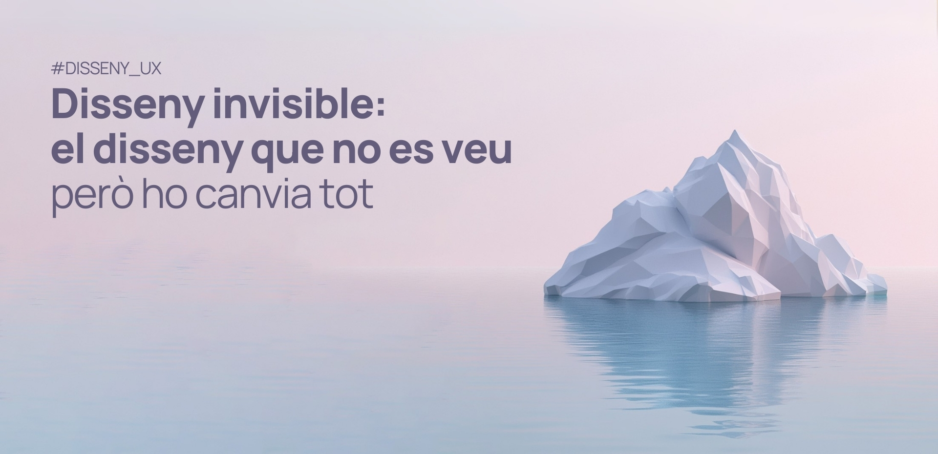
There are designs that go unnoticed, but have a very profound effect on behavior, experience, and emotions. This is called
What Does Invisible Design Mean?
It’s not about something that doesn’t exist, but about what is there, but is not explicitly perceived. It’s the kind of design that doesn’t draw attention because it doesn’t want to stand out; instead, it integrates with the function and context. When it works well, it goes unnoticed; when it works poorly, it can negatively influence without anyone being aware.
Invisible design is:
- A force that flows along the path of intuition.
- An information architecture that smoothly guides you where you want to go.
- A button that seems to know what you need before you click it.
But it can also be:
- A purchase flow that adds a product without notifying you.
- A cancellation button hidden with malicious intent.
- A system that frustrates the user because it doesn’t work correctly.
Invisible design is not always good design. In fact, it can be a subtle form of manipulation.
Design for the Subconscious
The concept of invisible design is not new. We find it in the ideas of Dieter Rams, who said “good design goes unnoticed,” Massimo Vignelli, who said “good design is a language, not a style,” and Don Norman, who stated that when everything works, design disappears.
Design also acts on our perceptions.
There is a fine line between helping and manipulating. And this is where invisible design enters the realm of ethics.
Dark Patterns: when Design Plays Dirty
In 2010, Harry Brignull named a practice that harms users: dark patterns. These are design strategies that seem harmless, but aim to deceive the user into making decisions they might not have consciously made.
Pre-checked boxes, hidden unsubscribe options, fictitious urgencies, bots disguised as personal messages… All of this is design. But it is design against the user.
The problem? We often don’t see it. Not only because it’s subtle, but because it’s meticulously designed to go unnoticed. And this is one of the biggest risks of invisible design.
The Imperceptible Virtues of Experience
When invisible design works well, the user experience is fluid and intuitive, almost imperceptible. It is precisely this subtlety that makes it so powerful. As designers, we have the opportunity to detect moments when we can further improve this journey, especially when we observe that the user does not complete an intended action. Although this doesn’t always generate complaints, it offers valuable clues to optimize the experience and make it even more effective and satisfying.
As Tony Fadell points out in his TED Talk, users have a great capacity for daily adaptation. We learn to double-click in a place where it wouldn’t be necessary. We accept that a button is poorly positioned. And because users adapt, problems become invisible through repetition, not resolution.
This adaptation is a testament to human flexibility, but it also reminds us of the importance of critically reviewing design. If we are able to identify what has gone unnoticed due to habit, we have a great opportunity to improve the user experience and offer clearer, more efficient, and intuitive solutions. That’s why companies need to look at their websites and applications with fresh eyes, those of an external observer.
The Real Value of a UX/UI Audit
A UX/UI audit is not just about checking if a website is pretty or if it works well on mobile.
It is a methodical process to detect:
- Subtle frictions that hinder actions on the website.
- Visual or tonal inconsistencies that create confusion.
- Flows that seem correct, but lead to a loss of conversions.
- Accessibility issues.
UX/UI audits allow us to make invisible stumbling blocks visible. Those small details that diminish value, trust, and results without anyone being able to clearly point them out.
It is important to distinguish between the visual impact of branding and the function of design. Branding —when well-executed— can be loaded with meaning and communicate many things. But it can also be just aesthetics. Design, however, cannot afford to be merely beautiful: it must function. Perhaps a brilliant graphic identity catches your eye, but if the interface confuses you, the message breaks down. The value of design lies not only in how it looks, but in how it is experienced.
The Unseen Must also be Designed
Invisible design can help or betray. It can liberate or manipulate. But what is certain is that it influences us, even if we don’t see it.
If you only think about design when talking about colors, logos, and aesthetics, you are leaving out the element that impacts most profoundly: how your brand is experienced.
Do You Want to Know What is Influencing your Relationship with your Users without You Noticing?
Let’s conduct a UX/UI audit, review the experience, detect blind spots, and turn invisible design into an opportunity.
